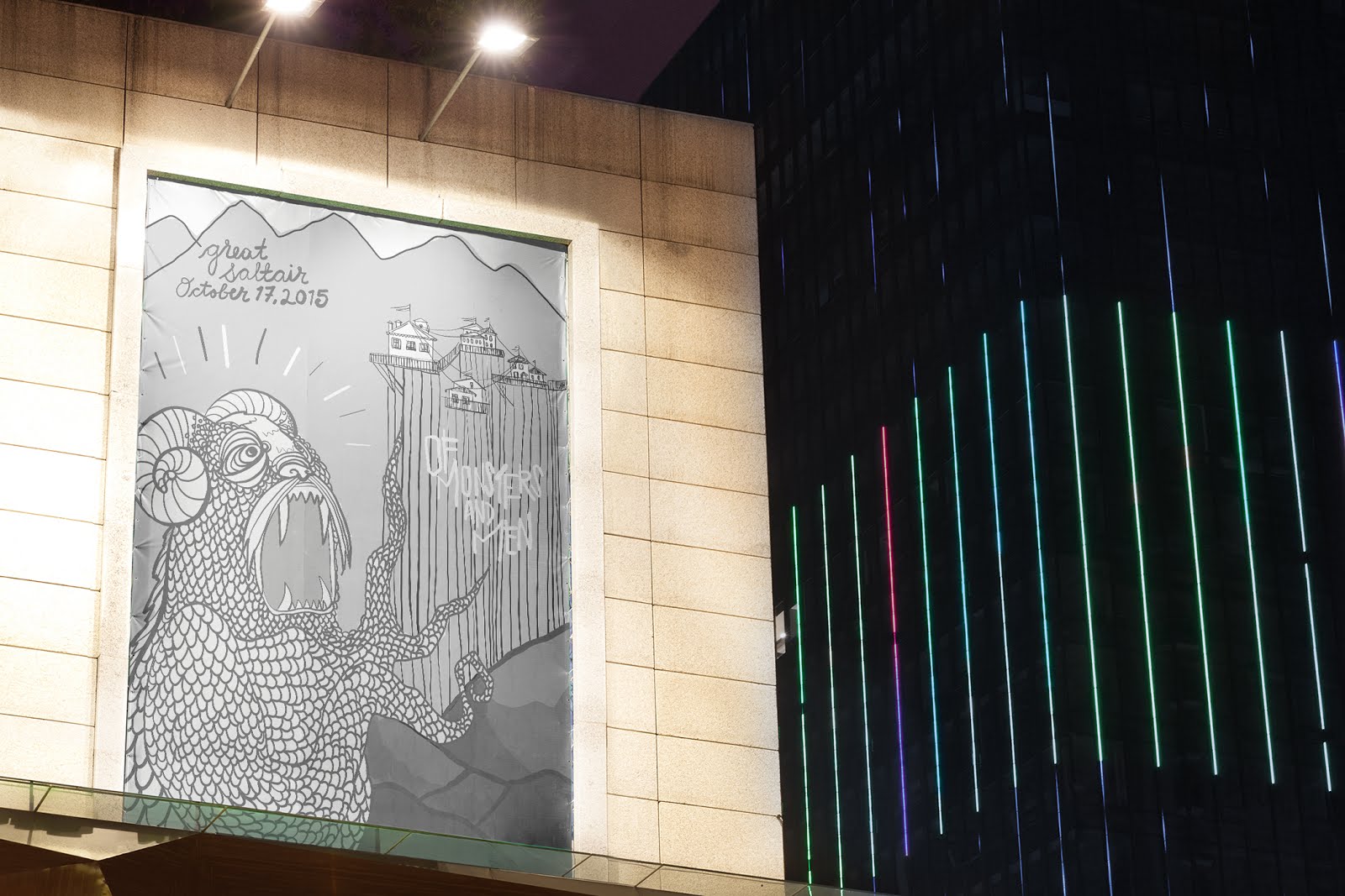
Illustration Final Drafts November 20, 2017
I have posted three separate options for the final poster. One is completely black and white, and the other has an accent color used to draw your eye through the poster,and THEN I chose to add texture to the colored version. I really think the color version is more successful because of that reason. I decided that the text inside of the beams wasn't really working out for me. I think that the name of the band was lost in the process. I also thought that the buildings were lacking in both design and that "whimsical" factor which is portrayed by the band. I styled the buildings based off of some in their music videos and added some embellishments to establish a more adventurous and fantastic looking city on a cliffside. I added shadows to give the piece more depth, which I believe was a good improvement.
The texture is something that I really enjoy and adds more character to the poster. I feel like it is my favorite out of the three, but I wanted to show the three different options for further opinions and to show my thought process.


Tight Illustration Nov 15, 2017
I included both one with and without text because I feel like the text is very pertinent to the illustration itself, since the title of the band is integrated into the beams. I am liking the black and white feel with some toned grays added for contrast. I don't know if this needs color or not. I was thinking maybe to add color into the text on the beams to make it stand out more, or even the additional information on the mountain. (If that is where I place it). I feel like I have a problem getting things to fit properly. Negative space needs to be played around with more. I know that this could probably be pushed more as an illustration... but I would like suggestions!!
Maybe adding a faint texture into the mountains and cliffside??


I saw Lily did a mockup haha and it looked like fun :)

Rough Concept Sketches Nov 9, 2017
These roughs were made based off of the thumbnail sketches.
The strongest compositions were the ones which created a narrative in the illustration.
I would still like the explore different design styles with in the first three rough sketches, because I think that they all could be pushed more. If at all possible, I will probably end up with two posters which correlate as a series. I think that would be great... who knows though?


12 Thumbnail Sketches Nov 8, 2017
I feel like I could definitely get 3 tight sketches from these thumbnails. I included an additional page of design concepts that I would like to integrate in the tight concept sketches.


Illustration Brief Nov 7, 2017

Concept Sketches Nov 7, 2017
I want to stay true to the band's originality and design. They are from Iceland, and they integrate cool tones, forest scenes, and mountainous landscapes in their music videos. Snow is a constant as well as whimsical stories of adventure. They usually include monsters in their videos with a kind of flat vector design with texture. I want to integrate faint texture into the design using both line to convey texture and overlay textures on the mountains.
The band's style switches back and forth between organic and geometric patterns in their designs.
In order to satisfy both styles, I used a geometric design in the posts holding up the house and a more organic/natural design with the mountains and the monster.

I have posted three separate options for the final poster. One is completely black and white, and the other has an accent color used to draw your eye through the poster,and THEN I chose to add texture to the colored version. I really think the color version is more successful because of that reason. I decided that the text inside of the beams wasn't really working out for me. I think that the name of the band was lost in the process. I also thought that the buildings were lacking in both design and that "whimsical" factor which is portrayed by the band. I styled the buildings based off of some in their music videos and added some embellishments to establish a more adventurous and fantastic looking city on a cliffside. I added shadows to give the piece more depth, which I believe was a good improvement.
The texture is something that I really enjoy and adds more character to the poster. I feel like it is my favorite out of the three, but I wanted to show the three different options for further opinions and to show my thought process.


Tight Illustration Nov 15, 2017
I included both one with and without text because I feel like the text is very pertinent to the illustration itself, since the title of the band is integrated into the beams. I am liking the black and white feel with some toned grays added for contrast. I don't know if this needs color or not. I was thinking maybe to add color into the text on the beams to make it stand out more, or even the additional information on the mountain. (If that is where I place it). I feel like I have a problem getting things to fit properly. Negative space needs to be played around with more. I know that this could probably be pushed more as an illustration... but I would like suggestions!!
Maybe adding a faint texture into the mountains and cliffside??


I saw Lily did a mockup haha and it looked like fun :)
Rough Concept Sketches Nov 9, 2017
These roughs were made based off of the thumbnail sketches.
The strongest compositions were the ones which created a narrative in the illustration.
I would still like the explore different design styles with in the first three rough sketches, because I think that they all could be pushed more. If at all possible, I will probably end up with two posters which correlate as a series. I think that would be great... who knows though?


12 Thumbnail Sketches Nov 8, 2017
I feel like I could definitely get 3 tight sketches from these thumbnails. I included an additional page of design concepts that I would like to integrate in the tight concept sketches.
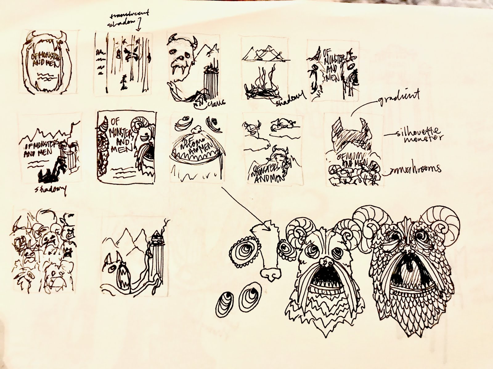


Illustration Brief Nov 7, 2017

Concept Sketches Nov 7, 2017
I want to stay true to the band's originality and design. They are from Iceland, and they integrate cool tones, forest scenes, and mountainous landscapes in their music videos. Snow is a constant as well as whimsical stories of adventure. They usually include monsters in their videos with a kind of flat vector design with texture. I want to integrate faint texture into the design using both line to convey texture and overlay textures on the mountains.
The band's style switches back and forth between organic and geometric patterns in their designs.
In order to satisfy both styles, I used a geometric design in the posts holding up the house and a more organic/natural design with the mountains and the monster.


Photo Reference Nov 7, 2017
I used different pictures from Iceland and their topography. I also looked at other gig posters that I would like to draw some inspiration from. I like the Kings of Leon simple, yet intricate, design. I also included stills from the band's music videos.
I used different pictures from Iceland and their topography. I also looked at other gig posters that I would like to draw some inspiration from. I like the Kings of Leon simple, yet intricate, design. I also included stills from the band's music videos.
